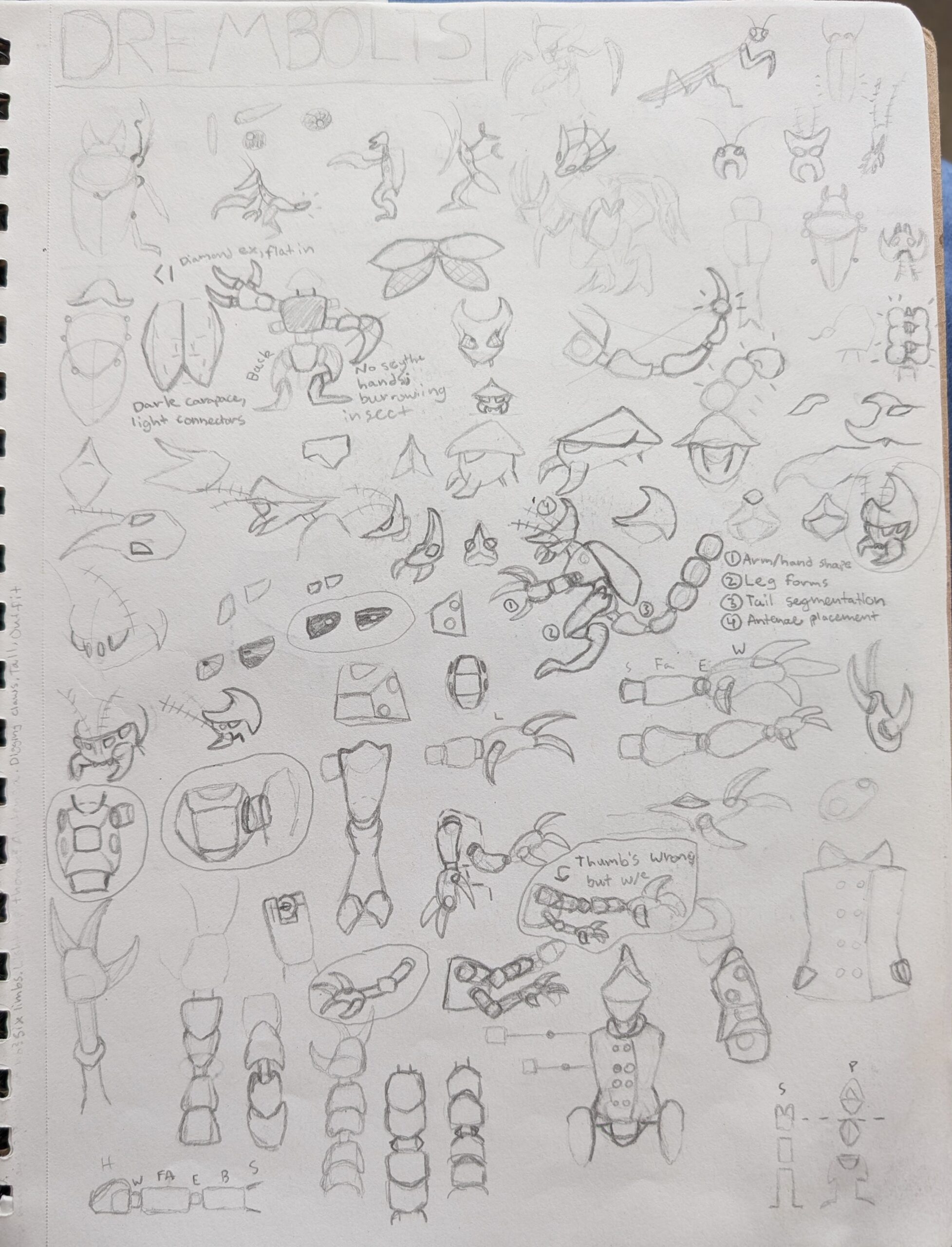
I had to spend extra time on developing these aliens, the Drembolts, since one of their number would be a main NPC: the final member of the security trio. Ultimately I went with something that’s about the cross between a rhino beetle, a mantis, and a scorpion. I wanted an alien that, at least on the surface, seems visually intimidating
… Which would add to the comedy of her being easily the most timid of the security trio. I like to imagine that the giant sword ship that’s crashed outside of Foundation B was actually a Drembolt ship, and that most of that crew bounced as soon as they realized their invasion had failed… all except for Peaches here. She’s definitely an odd one among her species.
While I’ve been trying each chapter to drop in at least one new alien, Drembolts overall are probably not a species that we’d see much of in the story, since I imagine them to generally tend towards being more militant (and therefore not particularly interested in the goody-two-shoes peoples that work together on Earth). But, as Peaches in this Chapter shows us, there are always exceptions to any generalities in species.
The security team aren’t overall the /most important/ element in the story, but I was proud of the little bits of character I’ve been able to establish with them so far. The trio are genuine friends tasked with doing the part of their job they never have to do! It’s a fun conflict to explore.